Barnes and Noble — Purchasing Journey Redesign
Barnes & Noble’s legacy purchasing journey contained friction across the full path from adding an item to the cart through completing checkout.
When customers added a product, confirmation appeared in a temporary pop-up rather than a clear, persistent cart state. The interface contained multiple competing actions, inconsistent button styles, account prompts, and limited visibility into product availability and fulfilment.
Once customers reached the cart, they could not always clearly review or edit the items they had selected. Together, these issues made the experience feel fragmented and reduced confidence before customers even began entering checkout information.=
The existing case study already identifies disconnected pages, overlays, account prompts, unclear progression, and inconsistent hierarchy.
Year
2026
Client
Barnes & Noble
Website
https://www.barnesandnoble.com/

The Challenge
The existing Barnes & Noble purchasing journey had evolved into a collection of separate pages, drawers, modal windows, and authentication steps. The legacy experience created several potential barriers:
Customers were interrupted by sign-in and account-creation prompts.
Important order information was distributed across different pages and overlays.
The checkout structure changed between desktop and mobile.
Users had limited visibility into their overall progress.
Forms required significant effort before users could continue.
Order totals and next steps were not always presented consistently.

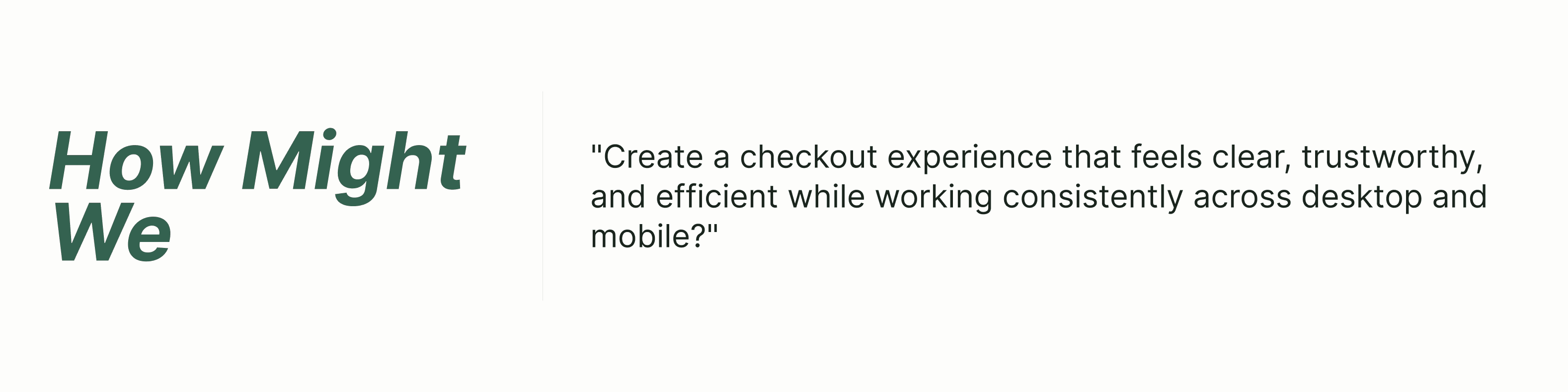
We mapped the journey from selecting a product through order confirmation, paying particular attention to the transitions between the product page, add-to-cart confirmation, cart, sign-in prompts, fulfilment selection, and checkout. The audit revealed that users had to move through several disconnected interaction patterns, including pop-ups, side panels, modal windows, full pages, account prompts,
Key Audit Insights
Adding an item did not create a clear sense of progress
After selecting Add to Cart, the product appeared inside a temporary pop-up. This created several issues:
The confirmation could easily be overlooked or dismissed.
The cart state was not persistent.
Customers could not immediately review the full basket.
The next action was not always visually obvious.
The interaction interrupted the product page rather than moving the customer naturally toward purchase.
2. The cart did not clearly support review and editing
On the cart page, the selected items were not always presented with enough prominence or flexibility. Customers had limited ability to:
Clearly review what had been added
Change the quantity
Remove or edit an item
Confirm product details
Understand whether their selections were saved
Recover easily from an accidental selection
3. Store pickup lacked availability and timing transparency
The experience included options such as Find My Store and Pick Up in Store, but customers had to select a location before receiving enough information to make a decision. The interface did not clearly communicate:
Whether the item was currently in stock
Which nearby stores carried it
How many copies might be available
When the order would be ready
Whether pickup was available the same day
What would happen after selecting a store
-
4. Competing actions weakened the visual hierarchy
The legacy interface presented several calls to action with inconsistent visual weight. For example, the PayPal and checkout buttons differed in size, prominence, and styling. Store-pickup actions, promotional content, account prompts, and purchase actions also competed within the same area. This made it harder to identify:
The primary next step
Which options were alternative payment methods
Which actions were related to fulfilment
Whether checkout had already begun
Which button would move the customer closest to completing the purchase
5. Sign-in prompts interrupted the purchase journey
A sign-in modal appeared before or during the transition to checkout.
Although signing in could help returning customers, the modal introduced an additional decision before users could continue with their purchase. It risked making account access feel required rather than optional.
6. The interface offered little positive reinforcement
The journey did not provide enough reassuring feedback after important customer actions. There was limited reinforcement when users:
Added an item
Selected a store
Chose a shipping option
Completed a checkout section
Corrected an error
Progressed closer to placing the order
Without these confirmations, customers could be unsure whether the system had registered their actions.


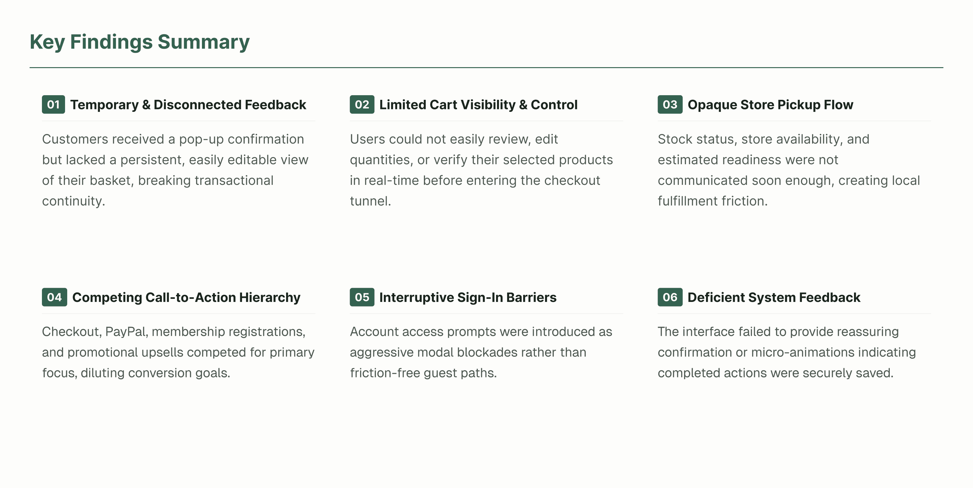
Key Audit Insights
1. Add-to-cart feedback was temporary and disconnected
Customers received a pop-up confirmation but lacked a persistent, editable view of their basket.
2. The cart offered limited visibility and control
Users could not easily review, edit, or verify their selected products before checkout.
3. Store pickup lacked early transparency
Stock status, store availability, and estimated readiness were not communicated soon enough.
4. Competing actions created an unclear hierarchy
Checkout, PayPal, account, fulfilment, and promotional actions competed for attention.
5. Sign-in prompts interrupted purchase momentum
Account access was introduced as a modal decision rather than an optional convenience.
6. The journey lacked reassuring system feedback
Customers received limited confirmation that their selections and completed actions had been saved.
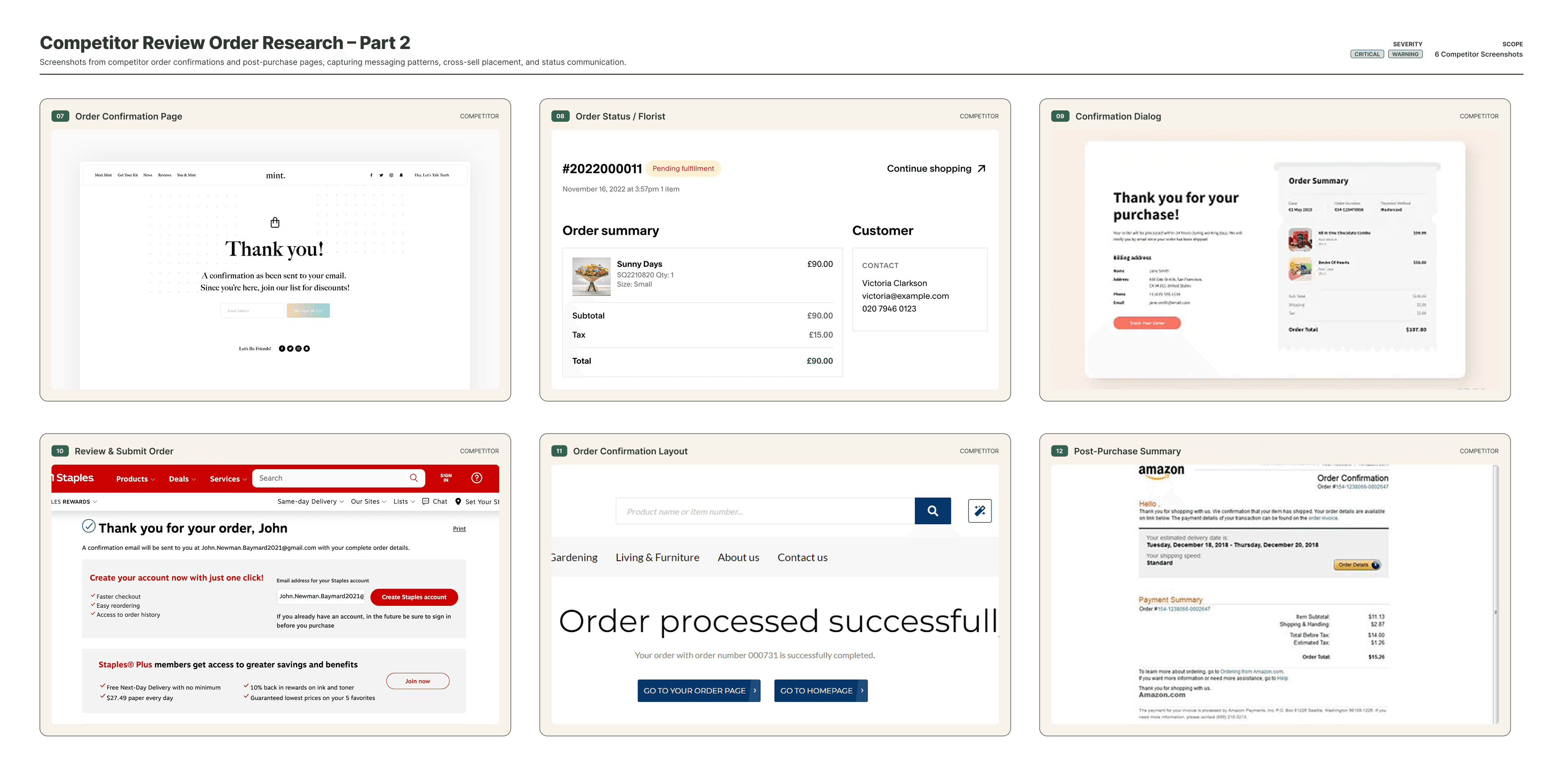
Competitive Analysis
We reviewed checkout experiences from comparable retailers and leading e-commerce platforms to understand familiar customer expectations. Patterns we looked at:
Guest checkout
Leading retailers often allow customers to continue without creating an account, reducing commitment at the beginning of the journey.
Visible progress
Checkout stages are usually presented as steps, sections, or an accordion so users understand the remaining effort.
Persistent order summary
Customers can reference products, delivery costs, taxes, and totals while entering information.
Progressive disclosure
Only the information needed for the current step is expanded, helping the interface feel more manageable.
Early validation
Errors are communicated close to the relevant field so customers can correct them before reaching the end.
Multiple payment methods
Payment options are presented clearly without overwhelming users before they are ready to pay.

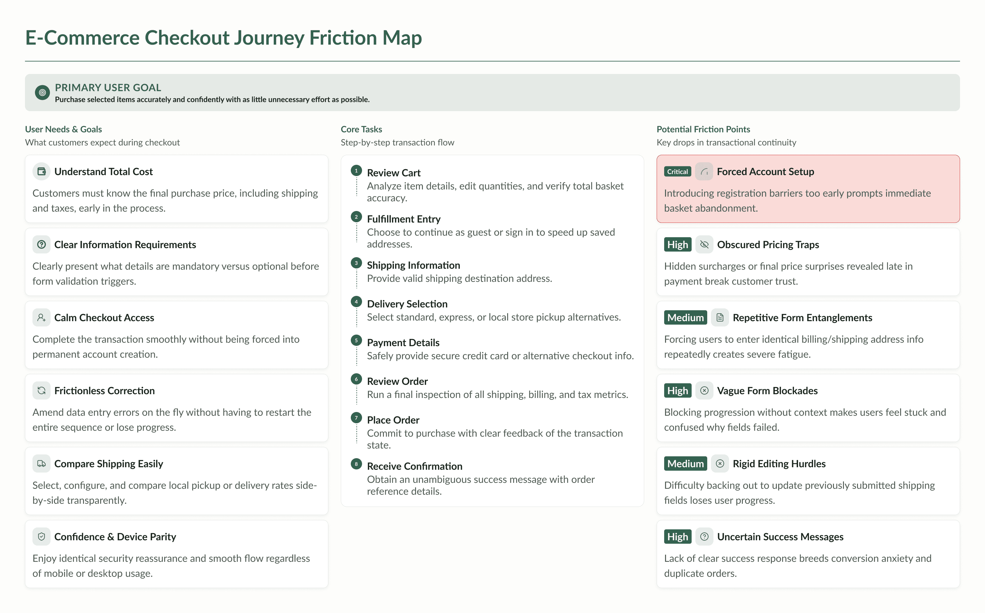
User Needs & Goals
Customers need to:
Understand the total cost of their purchase.
Know what information is required.
Complete checkout without being forced to create an account.
Correct errors without losing their progress.
Compare shipping options easily.
Review products before submitting the order.
Feel confident that payment and personal information are secure.
Complete the same journey comfortably on mobile or desktop.
Primary user goal: Purchase the selected items accurately and confidently with as little unnecessary effort as possible.
Core tasks
Review the cart.
Continue as a guest or sign in.
Enter a shipping address.
Select a delivery method.
Provide payment information.
Review all order details.
Place the order.
Receive clear confirmation.
Potential friction points
Being asked to create an account too early
Losing sight of the total price
Entering information more than once
Not understanding why a form cannot continue
Difficulty editing previously entered information
Uncertainty about whether an order was successfully submitted
Exploring the Checkout Structure
We explored different ways to organize the experience, including:
A traditional multi-page checkout
A single long form
A stepped checkout with separate screens
An accordion-based single-page checkout
The accordion approach offered the strongest balance between visibility and focus. Customers could understand the complete journey while interacting with only one main section at a time.


