Apple Online Store — Main Landing Page UX/UI Redesign for Easier Product Discovery
While Apple’s products set the standard for design and innovation, its retail spaces evolved from functional to immersive sometimes at the cost of easy product discovery.
Role
UX/UI Designer
Year
2025
Responsabilities:
User Interviews, Wireframing, Prototyping, Usability Testing
Problem
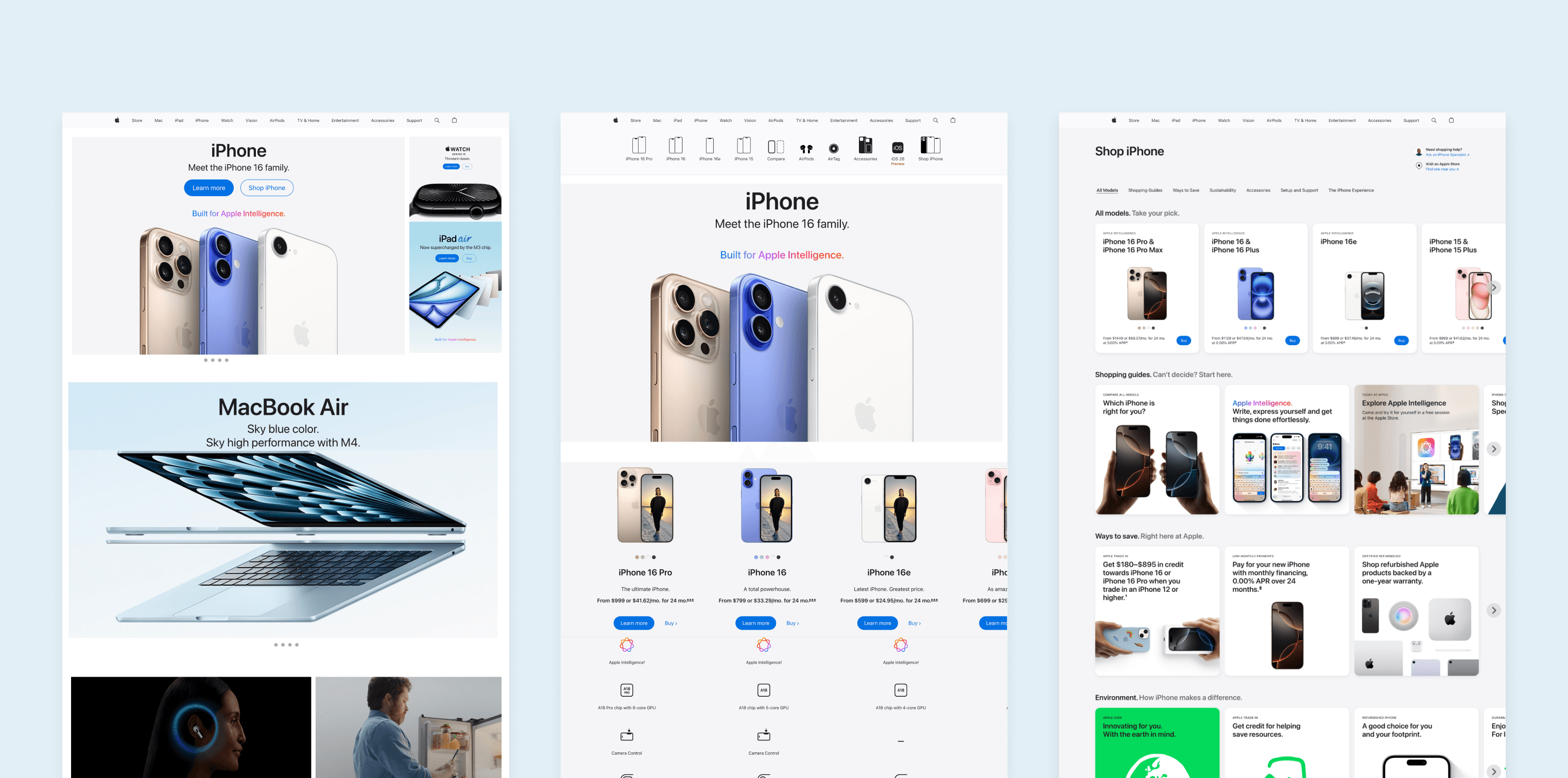
In recent years, the Apple Store has shifted toward a more immersive experience, featuring editorial stories, seasonal collections, and curated product highlights. While this evolution aligns with Apple’s luxury brand positioning, it can create challenges for users who want to quickly and easily find specific products.

Research
The goal of this research was to gain a deeper understanding of the current online customer experience on Apple’s website and identify key pain points within that journey. To do this, I reviewed user feedback from sources such as Reddit and the Apple Store.
Then, I conducted a competitive analysis across nine e-commerce businesses, by reviewing existing nine online e-commerce platforms to evaluate key strengths and weaknesses across each platform and uncover gaps, usability issues, and missed opportunities within current experiences.
The goal was to identify areas for improvement that could inform a more meaningful and effective customer journey.

Competitive research highlights view it here.
Competitive analysis
This competitive analysis highlights a clear spectrum in how e-commerce brands balance branding, storytelling, and product discovery. Brands like Apple, Samsung, and Google lean toward immersive, editorial-driven experiences that reinforce brand perception and emotional engagement, but can sometimes slow down direct product discovery.
In contrast, platforms such as Amazon and HP prioritize efficiency, specifications, and transactional clarity, often at the expense of visual storytelling or brand immersion.
Across competitors, common strengths include strong visual hierarchy, high-quality imagery, and curated product highlights, while recurring weaknesses include overly long pages, limited scanability, and friction in finding specific products quickly.
These insights revealed an opportunity to better balance immersive brand storytelling with clear navigation and efficient product discovery, guiding the design direction for a more intuitive and user-centrred experience.
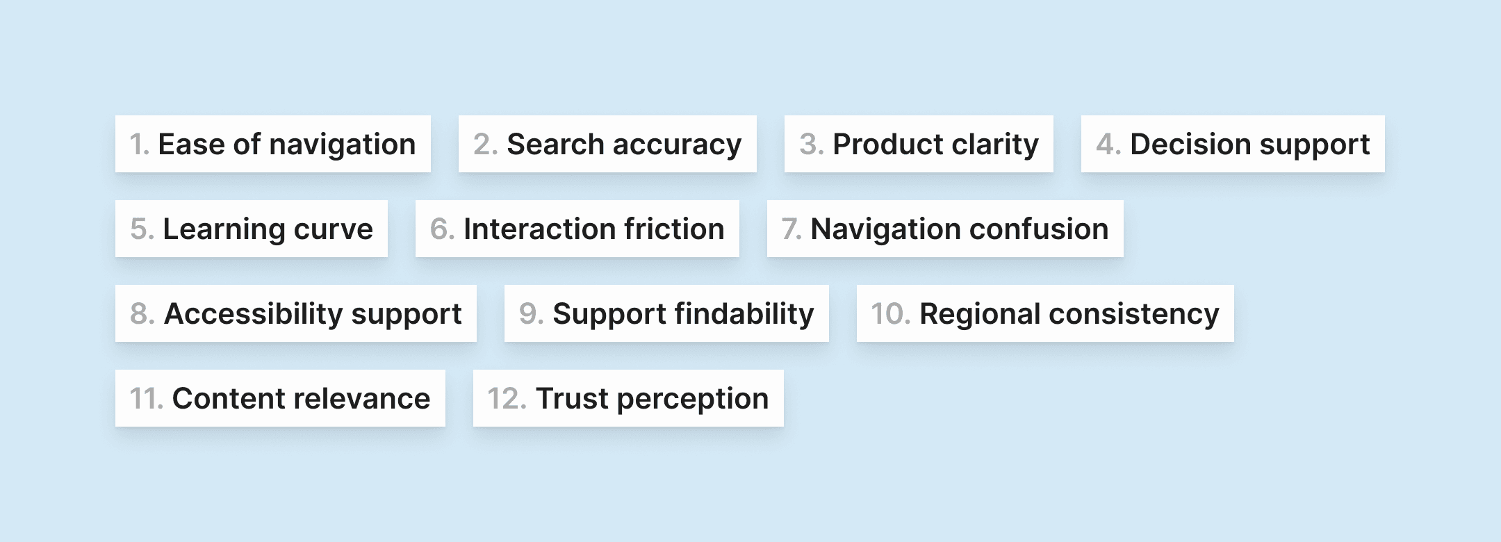
Competitive research highlights view it here.
Online reviews
This review of apple.com highlights a highly polished, brand-led experience that leads with visual design, storytelling, and emotional engagement, for example: the high-quality imagery, consistent typography, and scroll-based narratives reinforce Apple’s premium positioning and encourage exploration.
However, these strengths introduce usability trade-offs. Long, editorial-style pages can overwhelm users, while issues with internal search, product comparison, and regional consistency hinder efficient product discovery. Desktop interactions add friction: horizontal carousels are awkward to navigate, long scrollable modals require returning to the top to close, and the absence of breadcrumbs makes it difficult to navigate the site hierarchy. Excess unused space further reduces information density on larger screens.
Overall, the findings reveal an opportunity to better balance immersive storytelling with clearer navigation, desktop-friendly interactions, and faster access to products without compromising Apple’s premium brand experience.
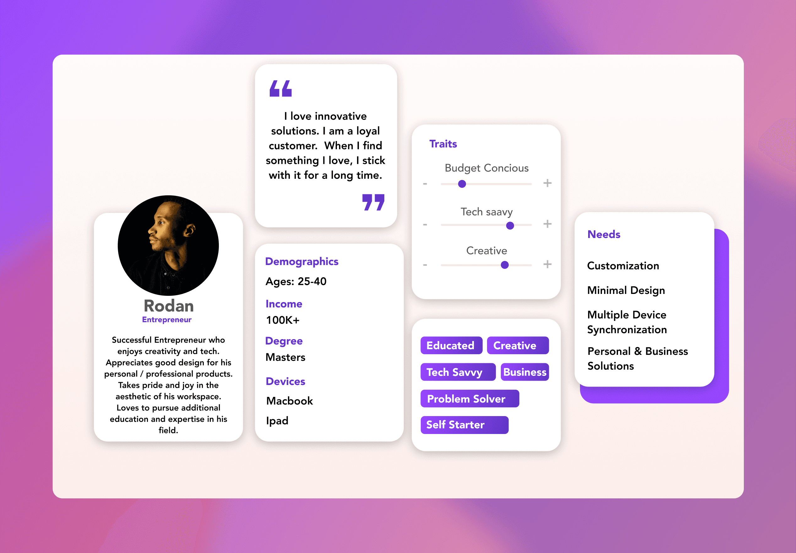

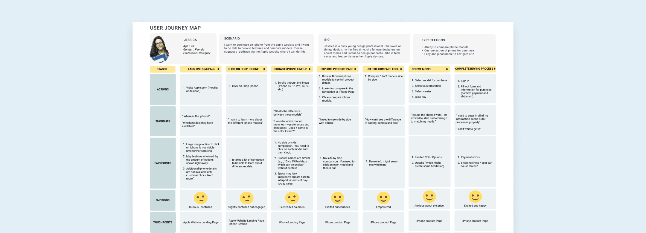
Personas and user journey maps informed by the literature review and online user reviews. view it here.
Ideation & Testing
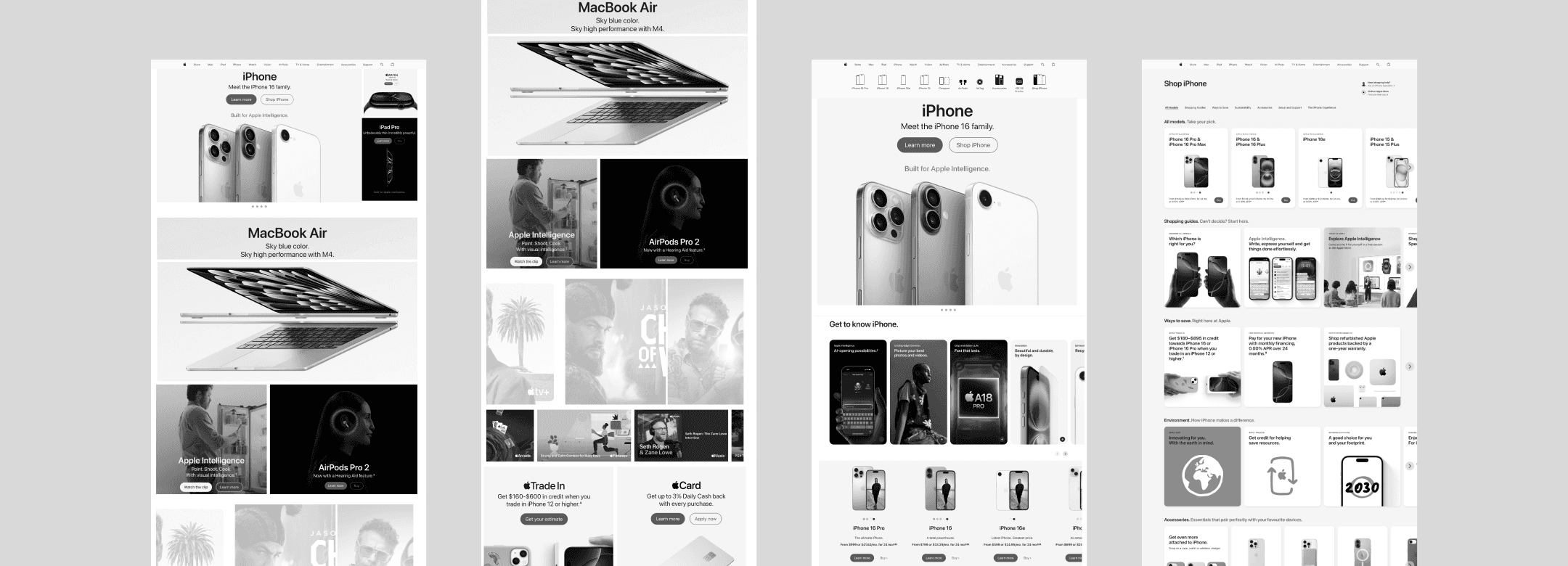
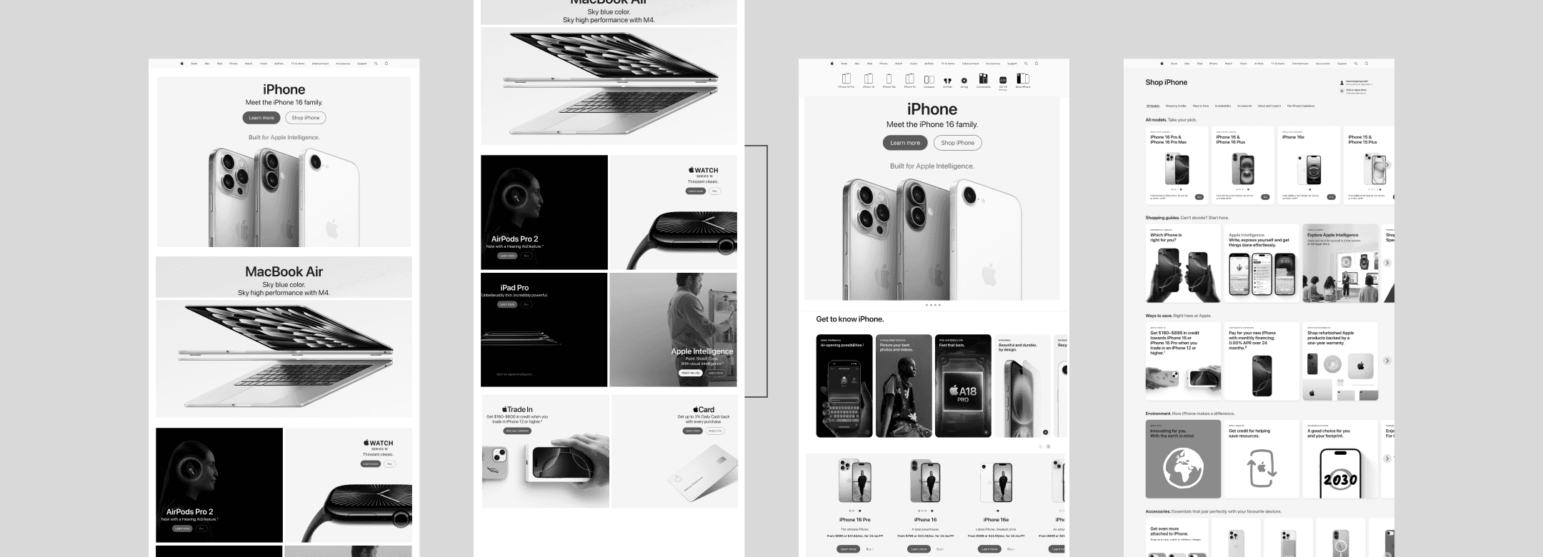
I designed three concepts ranging from conservative to high-risk, each varying in layout structure, section sizing, and content density. The intention was to create a more retail-like browsing experience, where users can immediately see multiple products rather than only a single hero.
The top banner focused on the latest product launches, while lower sections progressively revealed more products and features similar to how products are presented when entering an Apple Store.
This allowed me to explore different ways of increasing product visibility and helping users discover options earlier in their decision-making process.
Research Details
Research Goal: Understand how users navigate Apple’s homepage and iPhone purchasing flow, what information they need to make a decision, and which homepage layout best supports comparison and confidence before purchase.
Total participants: 5
Gender breakdown:
60% female (3)
40% male (2)
Age range: 38-64 years old
Backgrounds: UX design, marketing, healthcare, human resources, animation
Apple familiarity: Ranged from moderate to very familiar
Method: Moderated user interviews
Format: Remote interviews conducted via Zoom
Activities included:
Homepage exploration
Navigation to iPhone purchase flow
Comparison of multiple homepage layout versions
Verbal walkthrough of decision-making process
Apple Final Redesign Prototype
Key Insights
Comparison is critical: All participants emphasized the need to see price + product features together before making a purchase decision. Product comparison charts were consistently cited as the most valuable element.
Homepage should support exploration:
Most users preferred Versions 1 + 3, or a hybrid of both, because they allowed visibility into multiple Apple products upfront, rather than focusing on a single product.Clear hierarchy matters:
Several users found the homepage hero with multiple product features visually cluttered, suggesting clearer segmentation, more spacing, or breaking content into additional sections.Redundant CTAs cause confusion:
“Shop iPhone” and “Learn More” buttons felt repetitive when shown on both the homepage and iPhone detail pages, especially once users felt they had already committed to browsing iPhones.Navigation was successful overall:
All participants were able to complete user flows without issues and described navigation as smooth and intuitive.Different buying preferences exist:
Some users prefer purchasing online, while others feel more comfortable buying in an Apple Store or carrier store, highlighting the importance of accommodating multiple purchase paths.Desire for richer content interaction:
Users suggested:Adding short descriptive text to clarify sections
Introducing horizontal image scrolling to preview more products without overwhelming the page

Final Apple Redesign Screens

Final Apple Mobile Screens
Conclusion
Based on user research insights, the final design prioritized surfacing comparison tables earlier in the iPhone flow, allowing users to quickly evaluate price and features before committing to a specific model. Redundant primary calls-to-action were reduced across pages to minimize cognitive load and prevent confusion once users had already entered the iPhone journey.
The homepage layout was refined to improve visual hierarchy and spacing, making it easier to scan content and understand product groupings at a glance. The overall experience was designed to support exploratory browsing—encouraging users to discover multiple products—while still enabling efficient decision-making for users who arrive with a clear purchase intent.
